Retro sketched display font, personal-use TTF
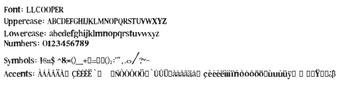
LL Cooper, by Markus Schröppel, is a sketched display typeface intended as a creative tribute to Cooper Black for headline and poster use. The font applies a heavy weight and hand-drawn 'doodle' texture to letterforms, supplied as a TrueType (.ttf) file that installs like a standard system font. It includes 183 glyphs, a rounded old-style serif structure, and a vintage 1970s bubble-font language. Designed for graphic designers and digital artists who need bold, nostalgic display type under a personal-use license.
The designer lineage places it clearly in a retro display tradition
The font comes from the developer's LL family and references Cooper Black, so its visual intent is deliberate rather than incidental. The developer's LL series includes titles such as LL Alarm and LL Rubber Grotesque, which shows a pattern of eroded, sketched, and stencil aesthetics. That lineage explains why the typeface reads as a deliberate 1970s revival suitable for projects that aim for a nostalgic, hand-made appearance.
Licensing and distribution require attention for commercial use
The font is provided as a demo for personal use and has distribution limits noted by the author. Key facts to note are:
- Personal-use license applies to the demo version.
- Commercial work requires obtaining a proper license from the author.
- The file is named "LLCOOPER.TTF" and the demo is intended for distribution via DaFont only.
Community uptake shows practical contexts where it performs well
DaFont download figures and forum mentions indicate broad hobbyist adoption, which aligns with the font's role in social-media graphics, posters, and branding. The community popularity suggests it works as a headline display when used at large sizes and in high-contrast layouts. Designers who favor a hand-drawn, bubble-font voice find it a ready-made option for visible, single-line display text rather than extended body copy.
A targeted choice for retro headline work, with practical limits
LL Cooper is a focused option for designers who want a nostalgic, hand-drawn headline voice and visible, vintage character at display sizes. It suits hobbyist and creative projects that accept a single-display style rather than a family of weights. Designers needing broader typographic flexibility should pair it with simple sans faces or choose a multi-weight family instead.